DUREX
Pleasure With Purpose
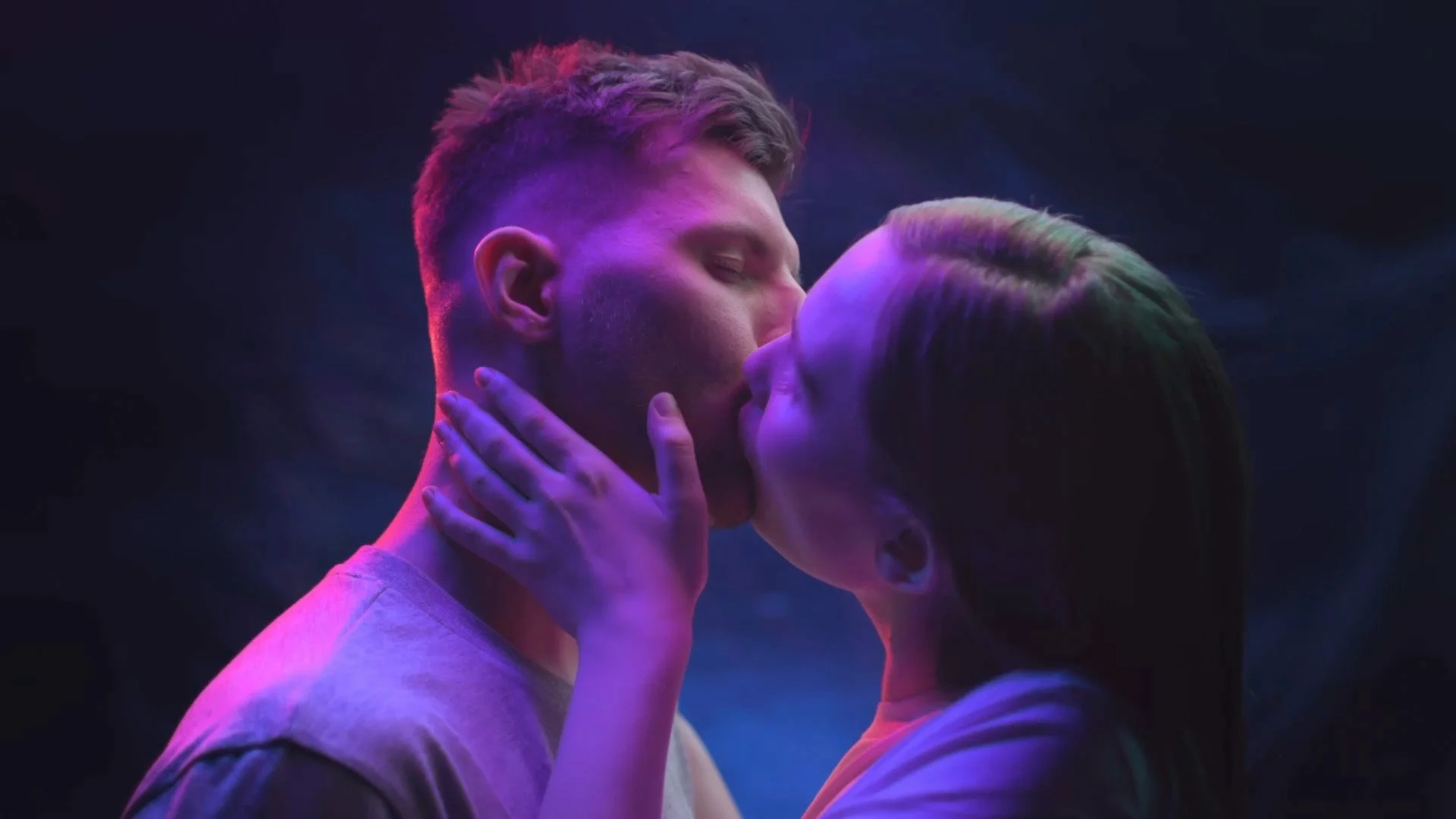
What if sex could be more?
For modern consumers, it is. Sex is fluid. It’s self expression. It's a connection – between yourself and other people, mind as well as body. Free from outdated rules and limitations, it’s an act of empowerment.
Now it’s time for another new era. Championing real sex, real intimacy, real desires. Changing the conversation. And giving consumers confidence to explore, experiment and enjoy on their own terms.
OPEN & CURIOUS
Self-assured, expressive and fluid – Durex’s new identity celebrates sex in all its forms. Retaining the trusted assets of the brand’s past, and making it meaningful and relevant for the future. Until now the logo was locked inside itself. Today it’s breaking through its historical holding shape, heroing the ‘X’, a symbol of intersection and connection.
Animated iconography
To help with product navigation and differentiation around the pillars of Fit & Feel, I worked on animating the iconography used on pack - with motion really helping to highlight some of the subtle (and not-so-subtle) differences between products within the Durex family.
PACK TO LIFE
Over the course of establishing the motion principles for the reinvent Durex brand, I wanted to ensure we had a variety of animated assets that could showcase the new product packing in the best light. Working alongside a 3D artist, I directed a series of shots to highlight details on the package, and ensured we represented the different substrates and print finishes that appeared different across the various product lines - these were then added to a series of animated sensorial background I created for each condom pack.